
By Courtney Taylor
One of the most striking features of the “Painting Enlightenment” exhibition is the sixteen-foot wall with gold Heart Sutra text descending downward like rain. The idea for this aesthetic feature had several iterations, but of one thing I was sure—the wall had to be dark with gold characters. Unfortunately, this criteria proved to make the project far more difficult than expected.

Photo by Alice Wack
Admittedly, I had my mind made up about gold on black for obvious aesthetic reasons. But Iwasaki’s use of gold on black and its relationship to traditional Chinese sutra copying only underscored the importance of making this happen. Guest Curator Paula Arai notes that gold signals reverence and honor and many of the greatest calligraphic devotional Heart Sutra copies are done in gold on black. In traditional copying of the Heart Sutra, however, each vertical line would be even. The vertical lines of different length represent how the Heart Sutra would be read right to left. (You can see the final mantra repeated three times in the far left corner.) This rendering represents an aesthetic compromise to fit the space and create a more dramatic, organic rainfall-like effect. Still, we needed gold Chinese characters.
Working with a local graphics company, I quickly learned that contour-cut vinyl lettering—a museum staple—was not going to be the answer. Machines are unable to cut the intricate Chinese characters. On to plan B. My next idea was to cover the entire wall in vinyl—to print a roughly sixteen by thirteen feet dark piece of vinyl with gold printed characters. Pricey, yes, but I wouldn’t be deterred. Not so fast, gold vinyl cannot be printed. Graphics plan C included negative space and a gold undercoat and was abandoned as quickly as it was considered.
When getting local sign painters was suggested early on, I was skeptical, but with the graphics options exhausted, I began looking for sign painters. I called a few companies in Baton Rouge who weren’t ready to undertake painting in Chinese—the Heart Sutra is comprised of over 250 characters, so I cannot blame them. At this point, others on the curatorial team were quite reasonably advocating that I abandon the project.

Finally, I stumbled upon Mystic Blue Signs, a company specializing in hand-painting signs and all things lettering. I spoke with Eve over the phone and was immediately confident we had a solution in her and her partner Vince. Vince had even studied Chinese. We talked over the scale, spacing, and size of the characters. I sent a simple word file. She started to work with a projector and pencil to scale the Heart Sutra to our sixteen-foot wall. After two eight-hour days in her studio, the 256 characters of the Heart Sutra were copied onto paper and perforated.

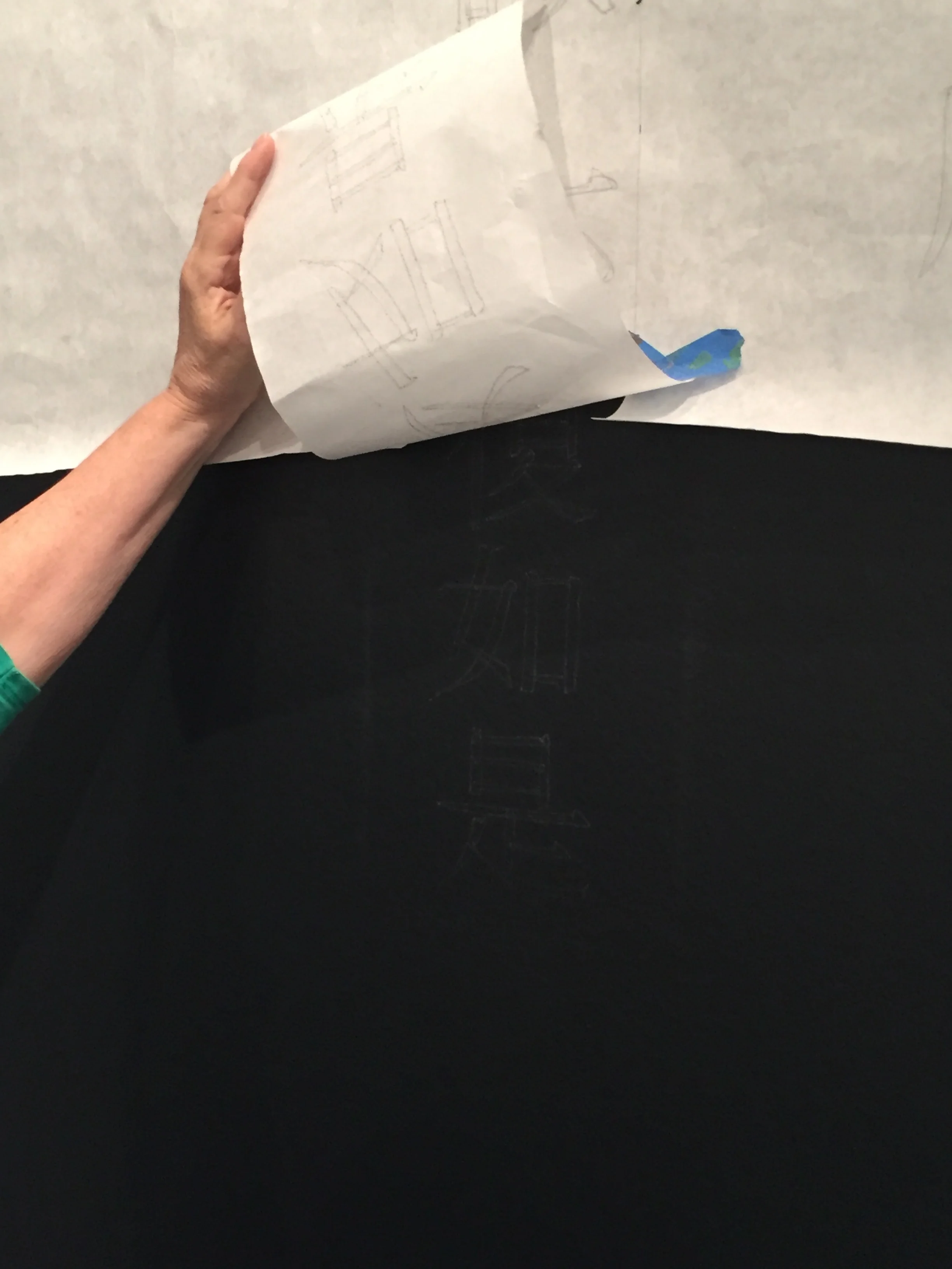


Eve and Vince headed to Baton Rouge. With the help of our genie lift and a few ladders, they soon had the perforated paper strips of Heart Sutra text taped to the wall. The next step was to lightly dust chalk over the perforated lines. This left a faint outline of the characters. Once this was done, Eve and Vince spent the next seven hours side by side hand painting each character (and charming museum staff along the way). They used a thick paint specialized for sign painting. The result is nothing short of fabulous! The presence of their hand, the shimmering brilliance of the gold paint, and elegance of the vertical lines that seem to fall like rain made this feature well worth the effort.
Courtney Taylor is LSU MOA's curator.